One of the tools traders have found to cope with the shortcomings of the Black and Scholes models has been to allow for non-flat volatilities, which means that the implied volatility of an option does not depend merely on the historical volatility in the underlying, but also on the strike and time to maturity.
Keep in mind that implied volatility is the real price of an option (as the interest rate is for a bond), and that options that have higher volatility are more expensive than those with a lower one. Be careful: there is a reason for some options to be stably more expensive than others, as there is a reason why German bunds are more expensive than Portuguese bonds.
We find different patterns depending on the idiosyncratic behaviour of each asset class. In this article, we will focus on equity indexes. Most of what is true for indexes applies largely for single stocks, though some adjustments need to be made.
The following charts displays the volatility surface of the S&P500 (as of October 8th, 2015) against moneyness and time to maturity. Moneyness is defined as K/S, where K is the strike of the option and S is the current value. A 100% option is an at the money option (ATM), a 90% will be a downside option (usually a put) and a 110% will be an upside option (usually a call).

Chart 1: S&P500 volatility surface (source of chart data: Bloomberg)
As you can see from the chart, the volatility depends on the strike. Downside options are more expensive than upside options. Literature has found many reasons for that. The two most convincing ones are that 1) bigger moves tend to be more on the downside rather than on the upside, and 2) moves in the volatility and in the spot are negatively correlated.
Concepts related to the term structure (how the implied volatilities change depending on time) are very similar to those of bonds, so it seems more interesting to focus on the behaviour of the skew.
When saying “volatility skew” we can mean both all the pairs of strikes and volatilities, given a certain time to maturity, or a specific number. In the latter case, the skew is often quoted as the difference between either the 95% and 105% volatilities, or the 90% and 100%.
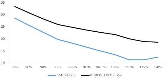
Chart 2: Implied volatilities on 3m options on S&P500 and Eurostoxx50 (source of chart data: Bloomberg)
As you can see from the previous chart, both the S&P and the EUROSTOXX have volatilities that are steadily declining, as the strike increases. However, despite the EUROSTOXX being a more volatile index, the 95-105 Skew is stably steeper for the S&P, both in absolute and standardized levels. This is due to both the idiosyncratic behaviour of each index and market flow factors.
Focusing on the behaviour of the volatility skew, there are two common sets of assumptions on how it moves: sticky strike or sticky delta.
In the sticky strike assumption, the implied volatility of each strike does not change when the spot moves. This is a very restrictive (and somewhat unrealistic assumption) that might work if the spot stays close to narrow bounds, but will be clearly wrong if the spot moves by a decent amount.
Sticky delta is a more reasonable assumption, according to which implied volatility is stable for options having the same delta. For equities, moneyness will be used instead of delta. Avoiding unnecessary complications for the purpose of the article, we can say that the underlying idea is the same and that moneyness can be taken as a proxy for delta.
Example: Spot = 2,000 | Strike = 2,000 | Moneyness = 100% | Implied Vol=15%
If the Spot rallies 10%, we will have a 90% option then; this, being a downside option, will be worth more as it is a downside option, everything else being the same. It is very important to note that “everything else being the same” is very restrictive. This is because in addition to the movement “along the curve” of our option, we will have a movement of the curve itself. Often, we would observe the curve shifting down in a rally, so we are not able to know whether the net effect would be a net increase or a net decrease in the implied volatility on which we price the 2,000 strike option.

Chart 3: Implied volatilities as a percentage of strike (source of chart data: Bloomberg)
From the chart above, it is easy to observe that, in a rally, downside options are marked on a higher vol than they originally were, while upside options are marked on a lower one. Theoretically, the ATM should move along the curve, but this is not always the case empirically.
This leads to a way to express a bullish position via delta-hedged options (NB: delta hedging is vital): buy the downside and sell the upside. While this might seem unintuitive at a first glance, it is clear from the previous chart that, if you hold a “downside” option and the index goes up, the option gets priced on an higher volatility, and is therefore more valuable. The reverse is true for upside options, which being marked on a lower volatility are less valuable.
While this strategy will often make money in a rally, it is not always so for two different reasons: options are exposed to more than one variable, and volatility might not behave as the model says it does.
The previous position might not make money if delta hedging is infrequent, or most importantly if we have a quick jump upward of the underlying. On the other hand, the strategy might still make money on a quick fall of the asset, due to the long gamma position on the downside.
The second reason is better explained through a real world example. On October 1st, 2015, the EUROSTOXX closed at 3,070.25, and it had climbed 4.5% to 3213.95 by midday of Thursday (October 8th, 2015).
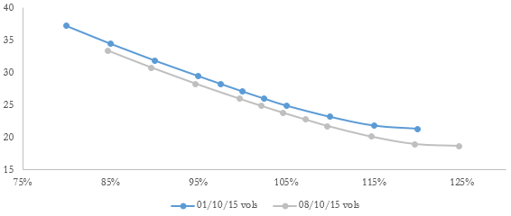
Chart 4: Implied volatilities as a percentage of strike Oct 1st vs Oct 8th (source of chart data: Bloomberg)
Volatilities are quoted as a percentage of October 1st, 2015 spot. In this case, we see a different movement than the previous one: volatilities shifted in a tidy parallel way, and there is no evidence of a behaviour similar to that of the previous chart. Actually, if one implemented the strategy, this would have resulted only in a small gain.
This simple example shows the risks involved in trading the volatility surface. Expressing views with options is often attractive in terms of initial investment, but the devil hides in the details more often than not.
[edmc id= 2952]Download as PDF[/edmc]


0 Comments